Find the mistake!
Dissecting a French website
June 2023, Paris

Full disclosure: this is not a brain teaser puzzle where you have to spot the mistake hidden inside an image! Neither the rather challenging find the hidden object puzzle where you have to track down certain items hidden in a picture with lots of confusing shapes, colors and objects that look darn similar to what you are looking for.
It happened to stumble upon the below website while doing a Google search on various transport insurance. While the website I found didn't have the information I was looking for, I spent some time perusing at the sleek design, and noticing the content legibility, the visual representation of various market indicators, and the correct use of spacing - which is considered a primary visual principle in web design.

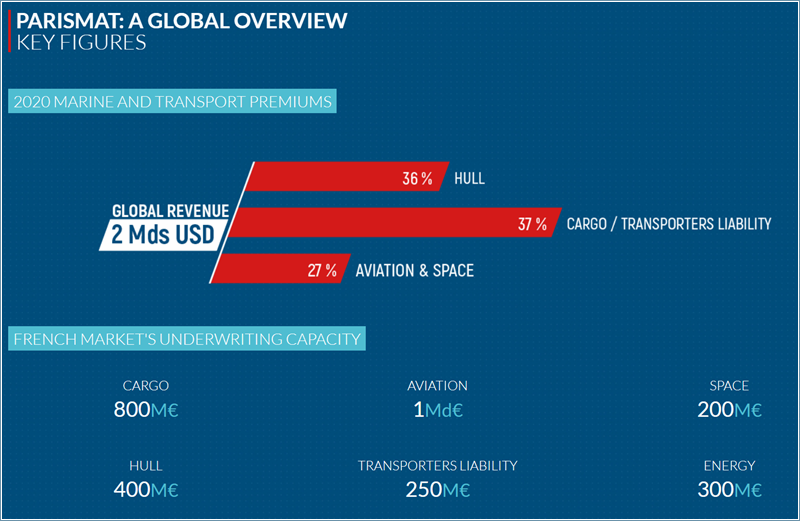
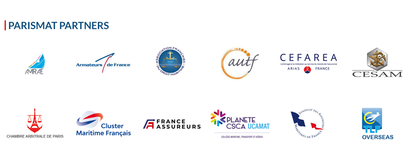
However, this post is not about the Parismat website, but one of the event's partners: CESAM. Upon noticing their logo in the partners section, looking rather obsolete in comparison with the sleek appearance of the others, I thought that it bears a slight likeness to the logo of Portuguese city, Lisbon (a silhouette of a ship with two crows sitting on its sides). Hence, I went on and clicked on it !...

A time travel to the beginnings of worldwide web
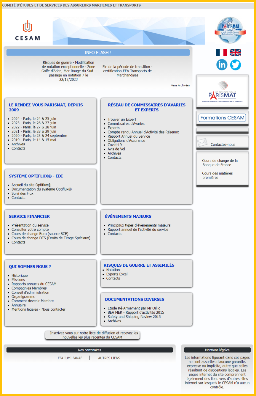
That's where you will be founding yourself upon visiting the official CESAM website :
the early days of website design, the 1990s.
A basic HTML structure, with some grey boxes and strong shadows.
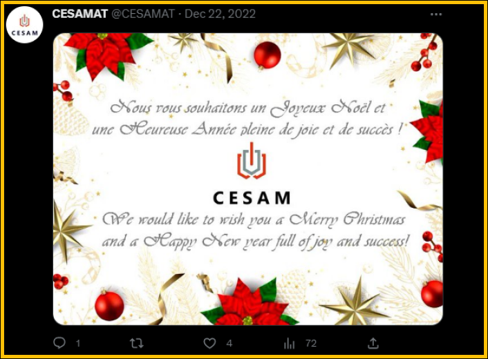
A sidebar with buttons, logos and obsolete Twitter posts bearing resemblance to a cohort of trashy ads.
At this point, I sense that some clarifications are deemed necessary:
◉ CESAM is an active business, a profitable company, its office located in the middle of Paris.
They describe themselves as an Economic Interest Group, providing services to member companies, bringing together French and foreign companies
in the marine insurance business.
◉ According to their description on LinkedIn, they organize events like ParisMAT since 2009
◉ They also act as training organization providing industry specific trainings - according to the catalog on their website,
19 trainings are planned in 2023
◉ They sell various sponsorship packages - according to one of their LinkedIn posts
Based on these facts, one has to wonder why a company with a substantial annual revenue doesn't dedicate a modest percentage of their profits to revamp their website and effectively showcase their business. Especially considering that the website serves as a gateway to announcing their major annual event, ParisMAT. Conversely, CESAM exhibits a frail, disordered, flawed presence in the online medium. Might also be a mirror of how they run their business.
CESAM website should act as a business card; instead, it exhibits the most disconcerting and dismissive stance towards its visitors. Dissecting this website will take many pages and days - it might take less time to re-design the website entirely.
⊑ The Hall of Shame ⊒



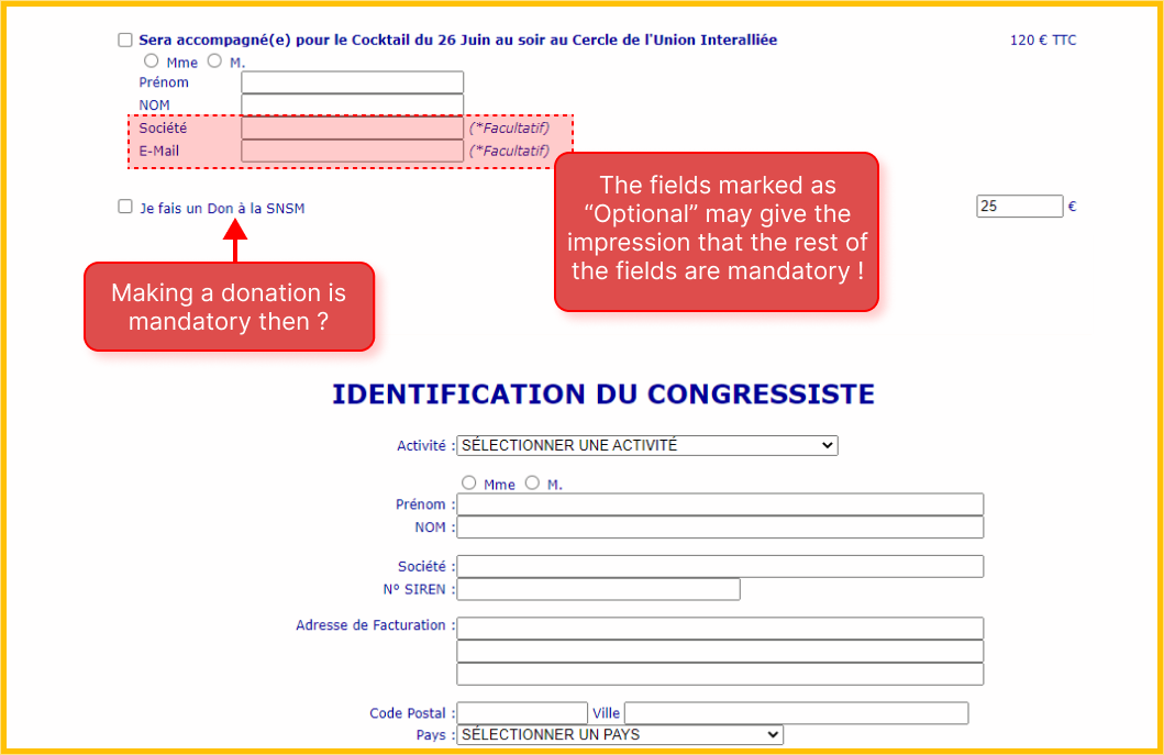
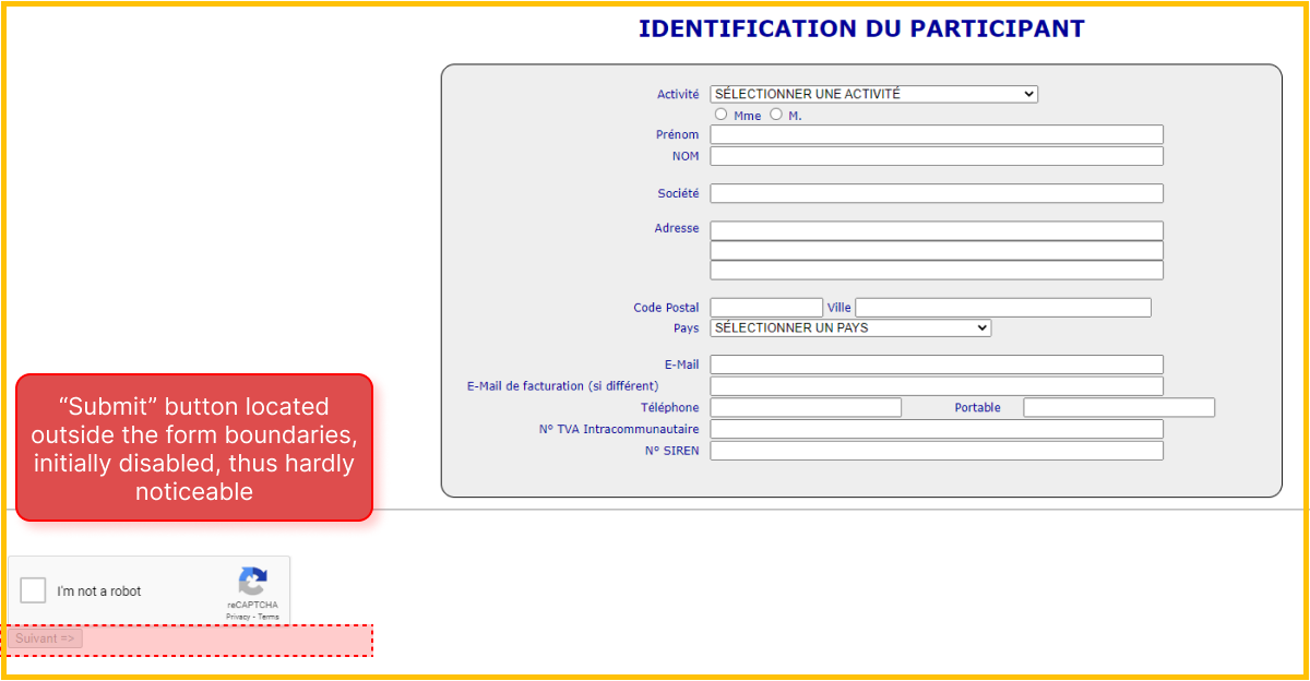
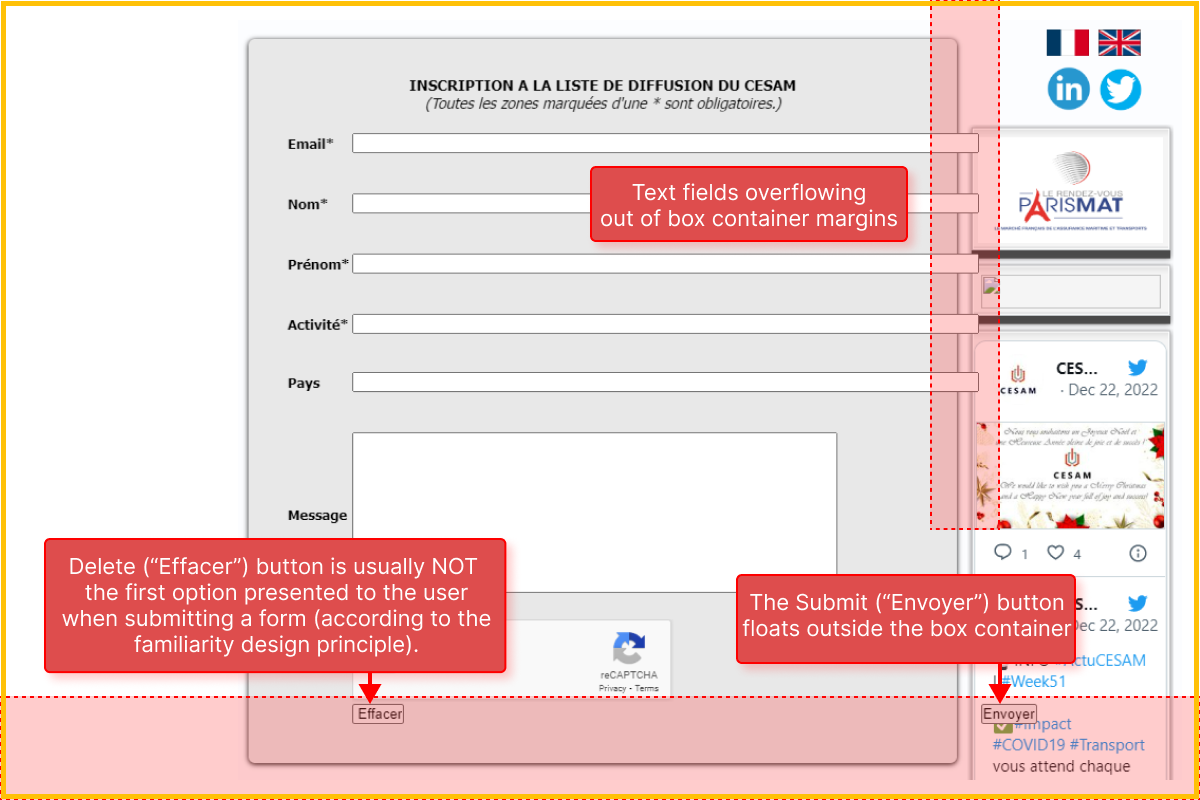
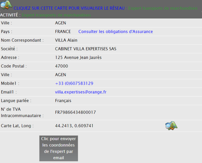
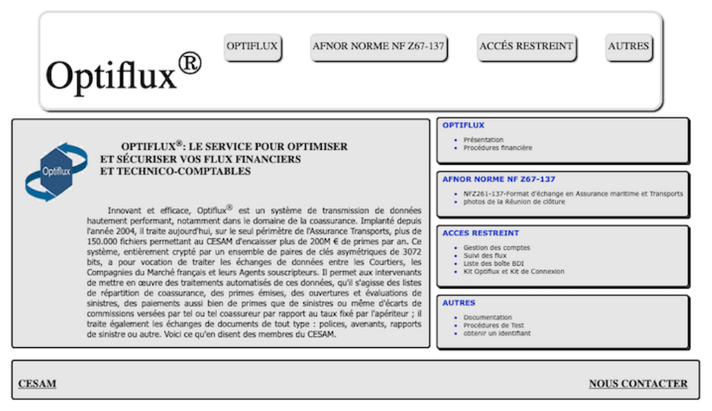
While I am aware of the multitude of outdated websites out there, CESAM website can easily set the baseline for the most bad design practices
in one single place. Talking about wrecking user experience !...
They also seem to be stuck in their happy place, with no urge to improve their website.
They keep adding new content with no consideration for maintaining consistency with the rest of the site.
Moreover, I sense that certain information within the uploaded PDF files should rather be confidential, as they look more like internal decisions,
with stamp and signatures. If that is the case, this is a security breach they should account for rapidly.
I assume none of these red flags matter to them; as the saying goes: If ain't broken, don't fix it!.
How to improve?
⌘
◉ Avoid excessive use of visual cues that convey an aggresive tone or a desperate attempt to grab attention (e.g. capital letters, also known as "shouting" in online communication).
◉ Carefully review the pages of your website to identify any obsolete links or outdated information presented as flash news.
◉ When embedding social media feeds (e.g. Twitter) ensure you have current information to display.
◉ Rebranding leftovers: if you've rebranded your business - new logo or color palette -, ensure these
modifications are uniformly and consistently reflected throughout your website.
◉ Consistency: encourage visitors to explore your website by ensuring consistent use of colors, iconography, typography
and navigation style across all pages.
◉ Proper placement of action buttons, form buttons, or important links.
◉ Confidentiality: be cautious with the information and files you upload on your public website, especially if they were originally intended for the intranet.
