To vote or not to vote
The official way of saying: You shall not vote on our municipal elections!
December 2023, Paris

One thing in the online medium that makes us cringe is the dreaded form, whether you’re making a purchase, applying for a job, enrolling in a course, or registering for an event. Among these, administrative forms, such as those for tax declaration, voter registration, or other income/expenses declarations, stand out as particularly daunting.
Not only do we have to fill out the numerous fields, prepare and upload additional files, but sometimes, some unknown error(s) will prevent us from submit it.
Most of the times, is not clear what specifically the error is, why it’s an error, or
how to resolve it.
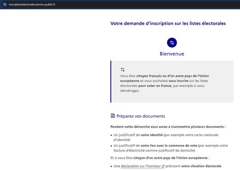
The site targeted in this post is service-public.fr , and more specifically, the section for applying for registration on the electoral lists. As described on their website , the online form allows French and European citizens to register their intention to vote in France.
Although the form design is quite sleek and modern, and the perception of tasks difficulty appears reasonable (given the nature of a bureaucratic request), there is a slight frustration building up due to the form’s considerable length and the requirement to prepare and upload additional proofs as part of the request. On a positive note, they notify you about this right from the start, as soon as you authenticate through one of the alternative methods they offer.


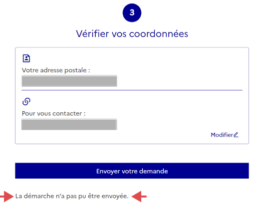
After completing the form and uploading all attachments, you’ll proceed to the next screen where you’ll need to verify the accuracy of entered data.
At the bottom of the page you will find the submit button you’ve been eagerly awaited. Upon clicking it, a message promptly appears below:
The request could not be sent.
Not only that the message can be easily overlooked, due to the absence of typical red color associated with a standard error notification, but it also fails
to provide any additional information regarding the nature of the error.

La démarche n'a pas pu être envoyée.
In fact, there are multiple issues here:
◉ Perplexing message : is there a genuine error (why isn't it in red) or simply a temporary problem with the site?
◉ The submit button remains active allowing repeated clicks without producing a different outcome
◉ User is stuck with no further actions available; the only alternative is to start over
◉ Poor usability : ambiguous message leading the user to repeatedly make the same mistake, perpetuating the issue
Interacting with this registration form results in a increased level of frustration for the user. It begins with requirement for additional documents, such as scanning an identity card or passport, download a utilities invoice, and filling out details to generate a declaration regarding voting rights in your country of origin. It then proceeds with a lengthy form and culminates in a perplexing error message.
Despite multiple attempts building up to few good hours, involving different settings such as different browsers, locations, Wi-Fi networks, and with or without VPNs, on different days, there was no success in sight, no light at the end of the tunnel. Exhausting all these options leaves the user with a negative perception, ultimately making voter registration an unattainable goal.
In a previous post you can read about two other French websites causing a similar feeling of frustration.
How to improve?
⌘
◉ Forms should have the least fields possible to avoid visitors being overwhelmed by long forms.
◉ Be explicit in your request or error messages, and provide steps for troubleshooting: it prevents the user from endlessley trying to click buttons, fields, and labels to no avail. Avoid multiple clicks by disabling the elements that are supposed to be clicked once.
◉ Design effective error messages, by ensuring they are highly visible. Reduce cognitive load with 3 important design patterns:
Familiarity - we subconciously associate error messages with a red-colored text;
Proximity - display the error message next to, or better, above the interface element requiring attention;
Grouping - to guide the user's visual attention for corrections, complement the error message with an icon (e.g., a large exclamation mark on a red background) or a thick red vertical line. It also considers accessibility, taking into account individuals with a color-vision deficiency.
◉ Avoid falsely raising visitors' hopes by allowing them to reach the end of the form and click submit, only to crush their expectations by forcing them to start over again, and worse, without indicating where or what the mistake is.
◉ Do not trigger helplessness feelings for the user which lead to frustration.